CollegeHumor’s DROPOUT: Brand Development
Roles: Art Director, Designer
Company: CollegeHumor
Skills: User Interface Design, User Experience Design, Brand Development, Product Development
Overview
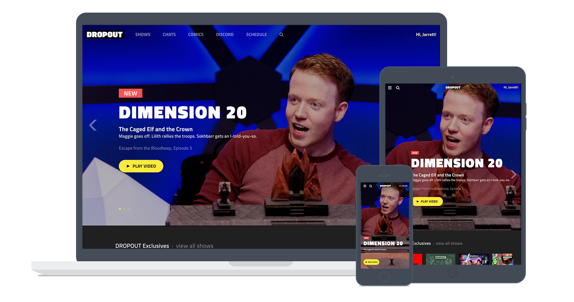
CH Media (CollegeHumor, Dorkly, Drawfee, and more) began transitioning from a largely ad‐supported comedy network to a multi‐revenue stream publisher. The cornerstone of the initiative was the launch of a subscription service called DROPOUT. This meant conceiving of an entirely new brand and bringing it to life visually across all of our external touchpoints, including product, marketing and sales.
As Art director, I led the creation of visual brand assets and interactive experiences across all of our properties in all types of media – video, web, corporate communications – spearheading both design and user experience, working with and directing both internal teams and external vendors.
First Round
In the initial round of brand development, I created logos to help express the different avenues were considering. The Humorology logo was an ambigram, alluding to a secret coded language. The logo for Major was the most direct play on a desired association with the “collegiate” part of the CollegeHumor brand name. The Inside Joke logo makes reference to the eye of providence symbol that CollegeHumor had been hiding in its videos for years.
Second Round
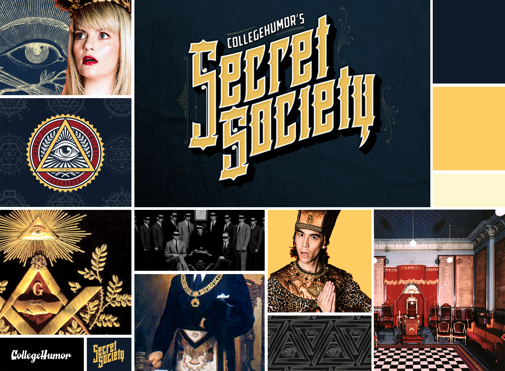
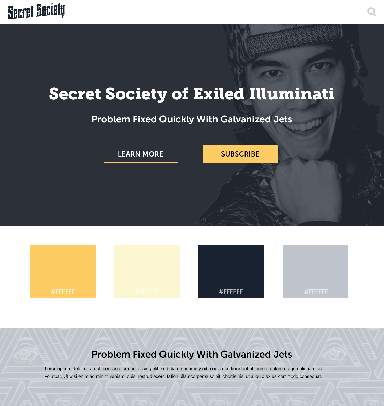
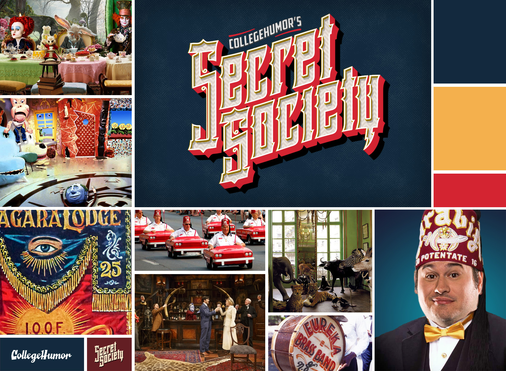
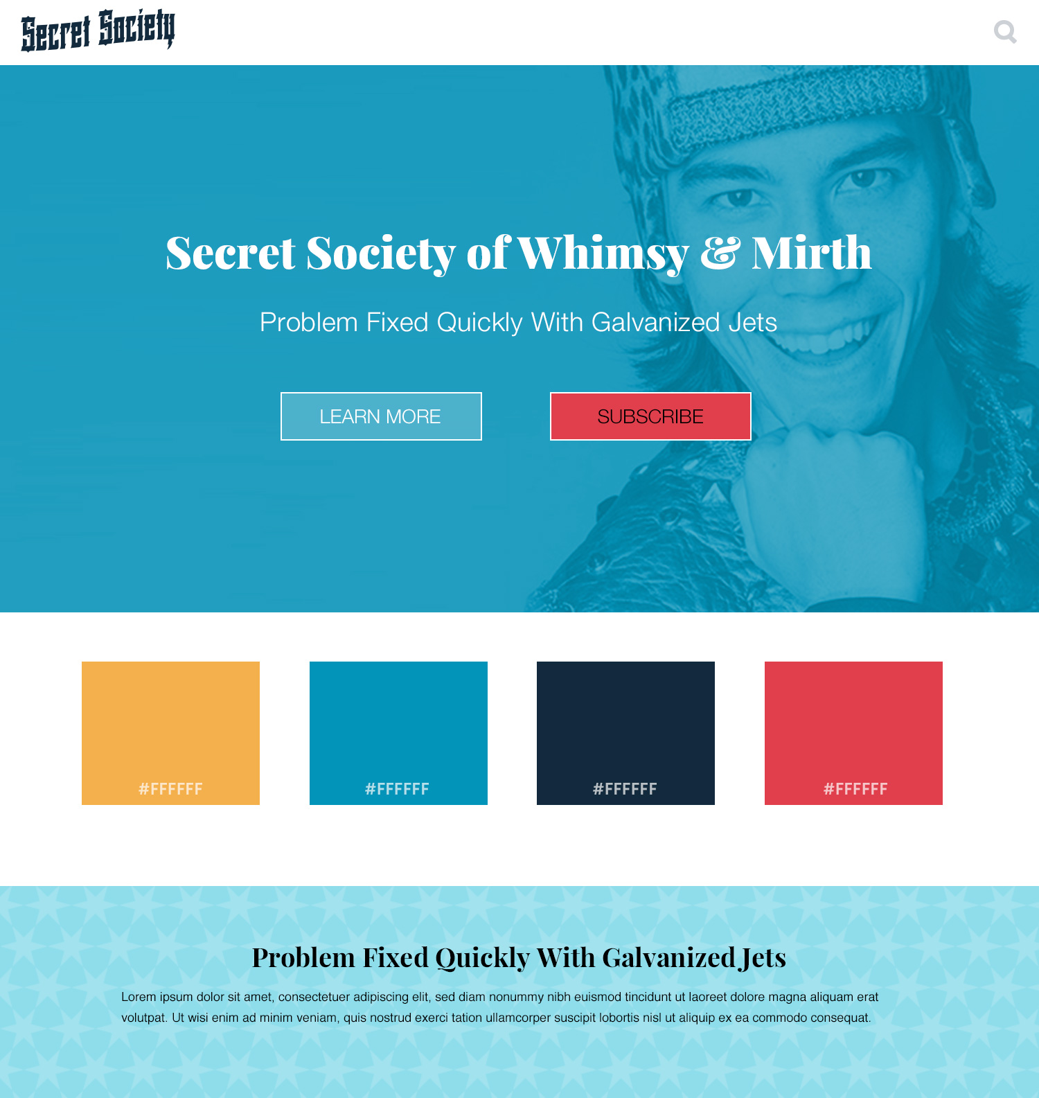
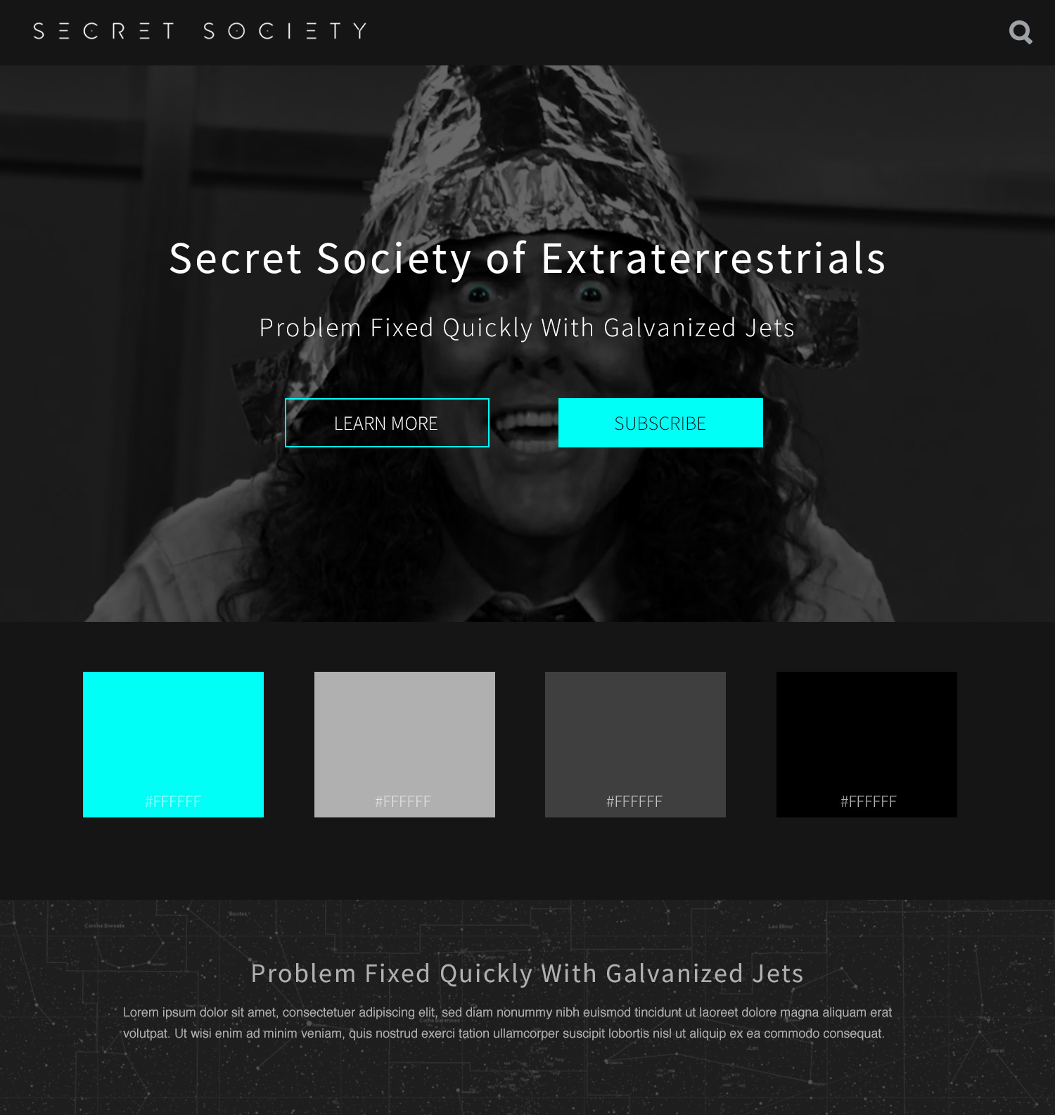
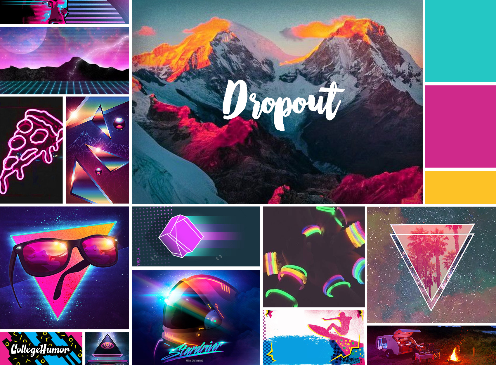
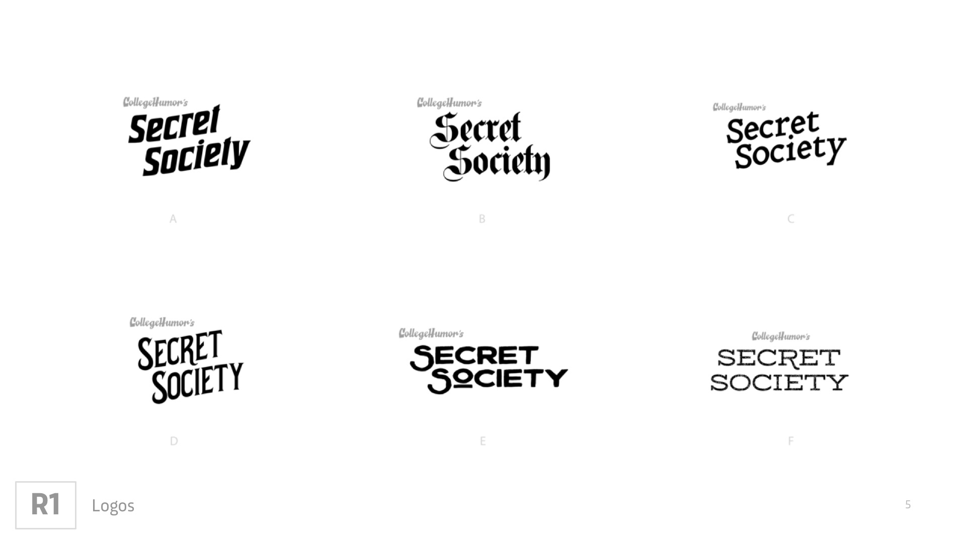
We operated with the working title “Secret Society” for a while. These were some artifacts from that process. Mood boards captured different notions of what the Secret Society name evoked, and preliminary interface sketches demonstrated how they might be presented to our users.
Third Round
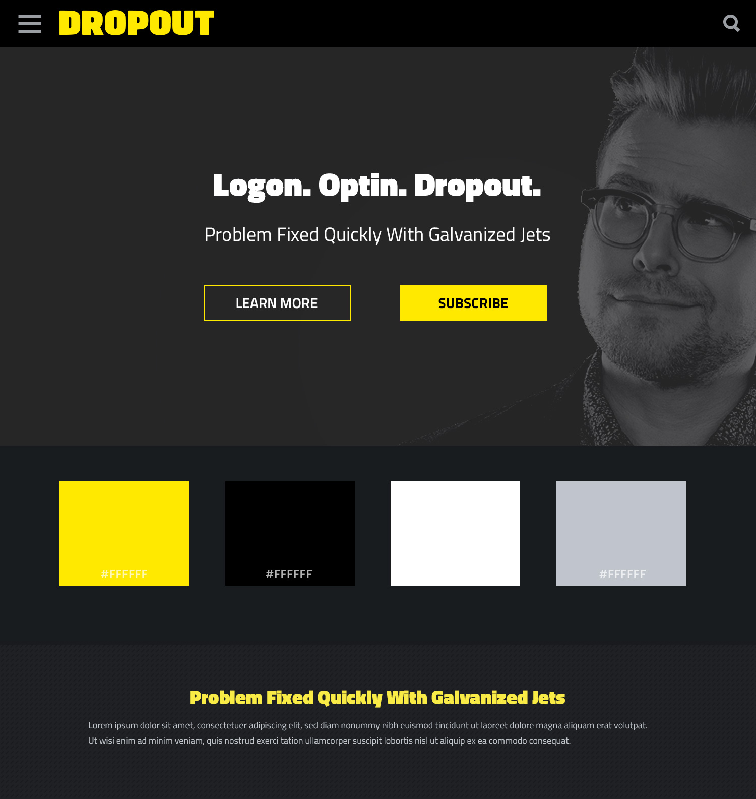
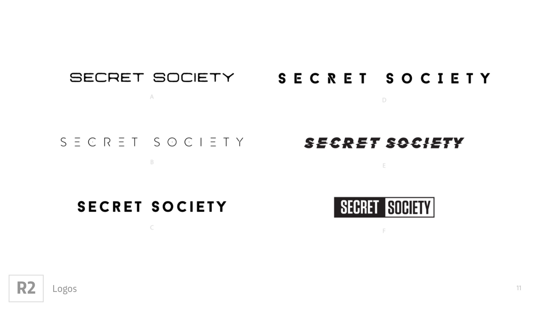
Based on presentations to internal stakeholders, I evolved the idea of how we thought about Secret Society. These mood boards and style tiles are artifacts from that phase of the process.
Dropout
It was decided that DROPOUT would be the brand name. A direct reference to the evolution of CollegeHumor, the ethos of DROPOUT would allude to “dropping out,” as well as a Timothy Leary-esque inteperatation of evolving one’s consciousness. It is an optimistic rejection of the status-quo in favor of truth and self expression. As such, the visual identity would be bright, bold, and just a touch psychedelic.
Branding
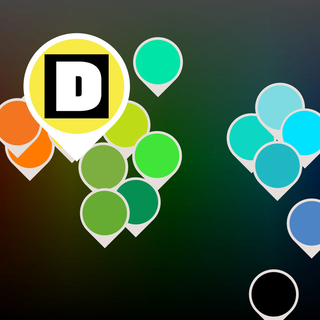
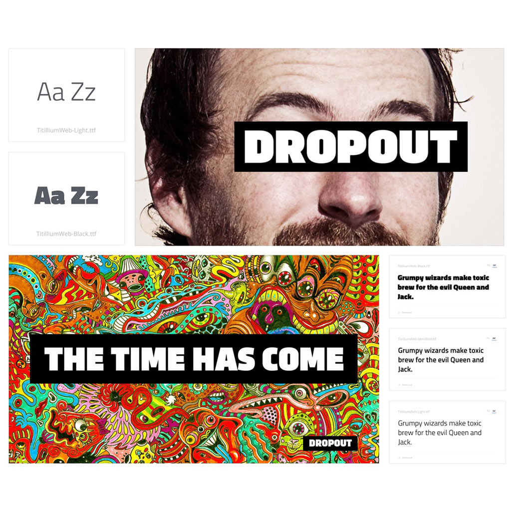
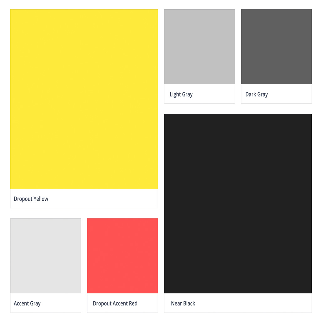
I undertook extensive surveys of the landscape, and presented the findings to internal stakeholders to support the choice of this unique primary brand color. A bold but straightforward type choice would convey both comedy and earnestness. I outlined some potential campaigns, one of which would use DROPOUT as a literal brand, and underscore the uncensored and risk-taking nature of the brand..
Design System and User Interface Elements
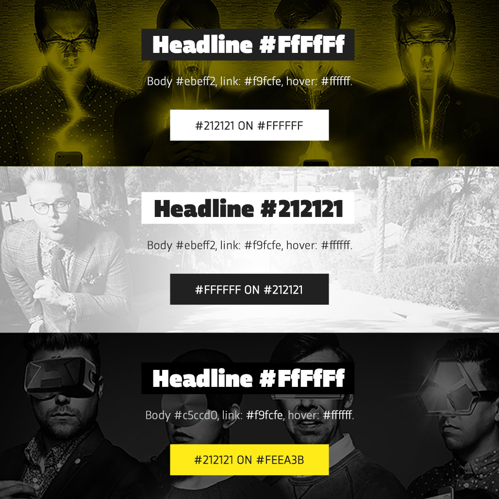
After creating the brand identity, I developed a flexible design system to help internal teams and external developers build a consistent brand experience across all of our touchpoints. For more on the process of UI and UX development, visit the link below.
Brand Guide
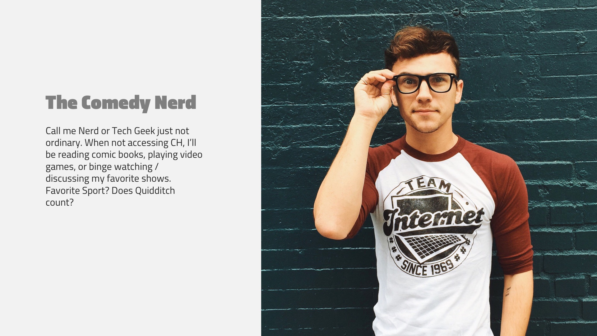
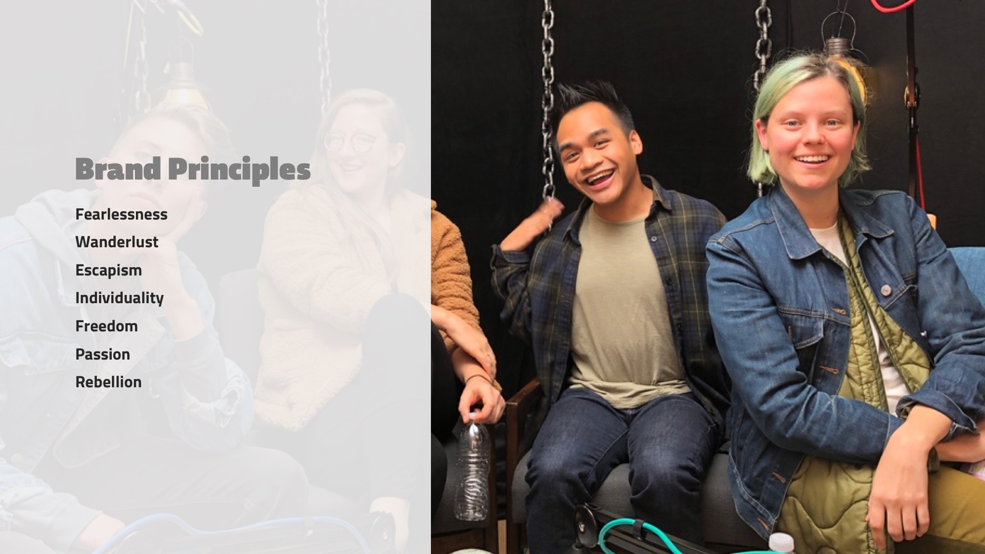
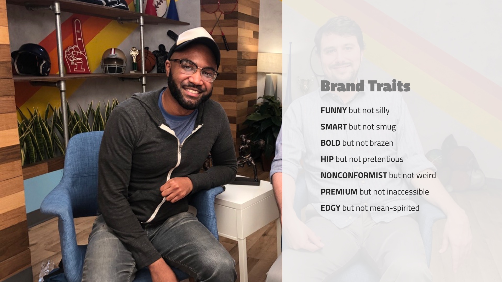
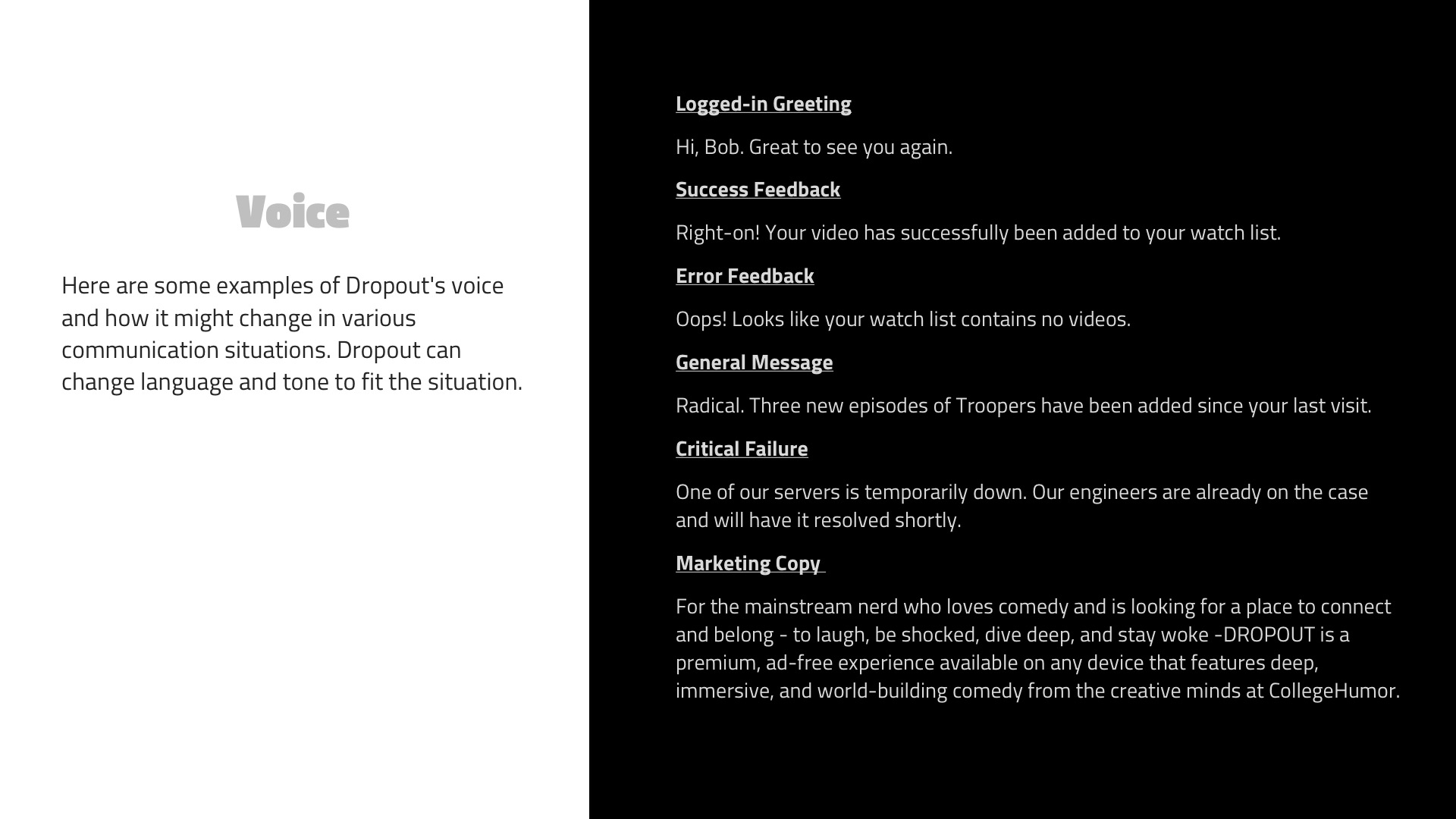
Prior to embarking on product design and prototyping, I created a preliminary brand bible to help guide our internal teams and vendors, serving as a roadmap to shape thinking about the new brand.
