CollegeHumor’s DROPOUT
Company: CollegeHumor (IAC)
Roles: Design Director, Designer
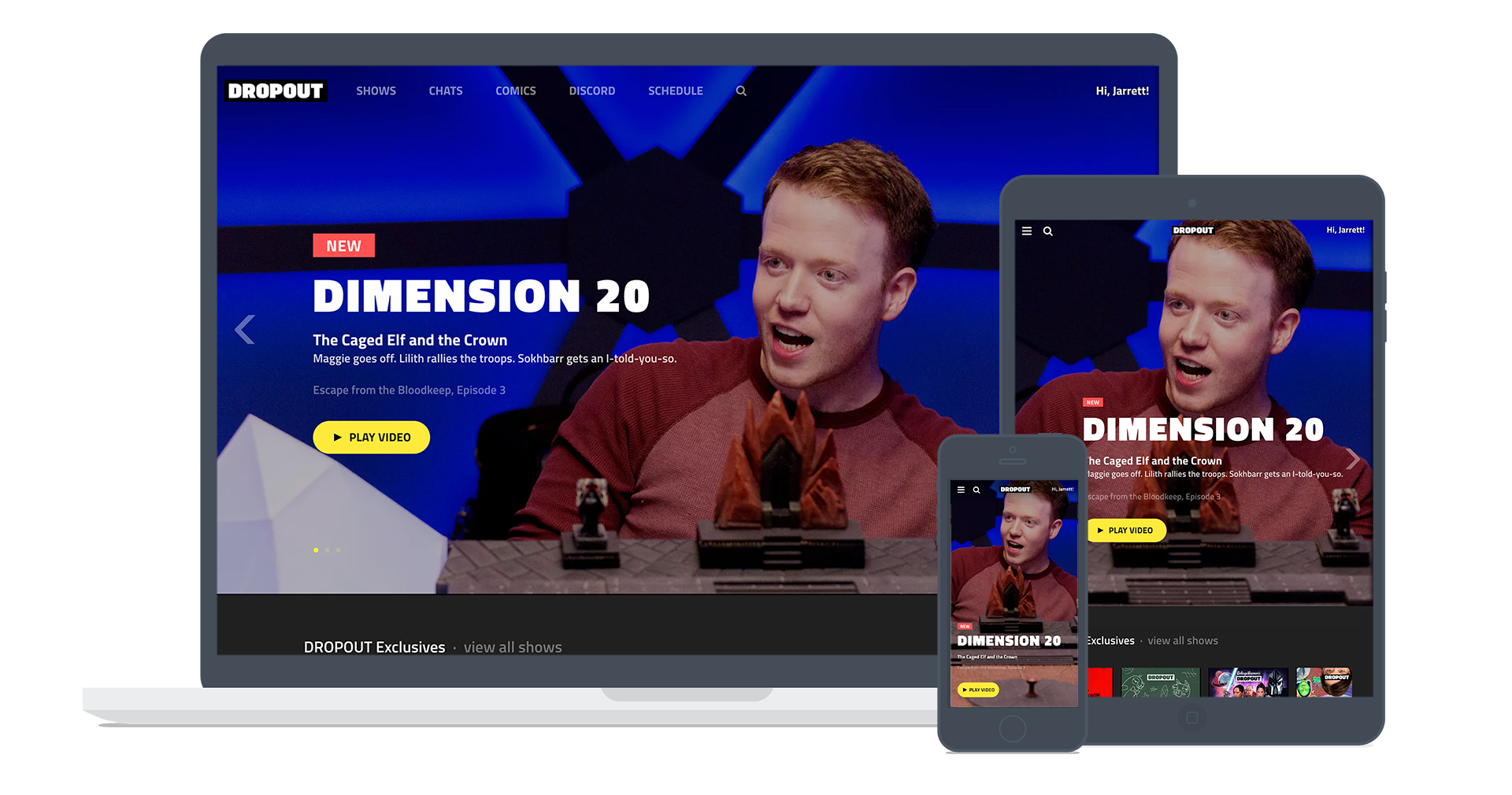
As CH Media evolved from an ad-supported comedy network into a multi-revenue stream publisher, it launched DROPOUT – a subscription-based digital entertainment platform featuring original video content, digital comics, and interactive storytelling. As Design Director, I led the end-to-end design and UX strategy, developing the brand identity, design system, and user experience across web, mobile (iOS and Android), and connected TV platforms (tvOS and Android TV). Through rapid prototyping, user-centered design, and close cross-functional collaboration, I helped deliver a standout product in a highly competitive digital media landscape—on an aggressive startup timeline.
Features
DROPOUT is a subscription video platform that also offers innovative digital comics and interactive chat stories. Users expect seamless access across devices—from phones and tablets to connected TVs. Starting with a beta web launch, I led brand design, UI system design, and UX strategy across all platforms.
Digital Comics
Designed as a mobile-first experience, DROPOUT’s digital comics were available on most platforms. I led the UX and UI conception and development of this feature.
Chat Stories
Also conceived as a mobile-first experience, chat stories allowed for interactive storytelling in a familiar format. I led both UX and UI design and development.
iOS App
The DROPOUT app for iOS featured fullscreen video thumbnails on the home screen to highlight the depth and variety of content. I implemented a testing and production workflow to ensure the vision was realized despite technical and production challenges.
Android App
Similar in experience to the iOS version, the Android app was adapted to meet platform-specific UI and UX expectations. I oversaw the design adaptations to ensure consistency across devices.
tvOS
For tvOS, speed to market was prioritized over custom features. We employed standard UX patterns and adhered to platform conventions, while integrating brand elements to maintain identity.
Android TV
As with tvOS, the Android TV app prioritized rapid deployment. It followed standard UX frameworks, incorporating just enough brand customization to maintain a consistent experience.
Key Art
I created or commissioned key art for all series on DROPOUT. For new shows, I led creative kickoffs and organized photoshoots as needed. For archival series, I produced effective visuals with limited resources. Every piece was designed to stand out at small sizes within crowded visual environments. See more key art
Brand Identity
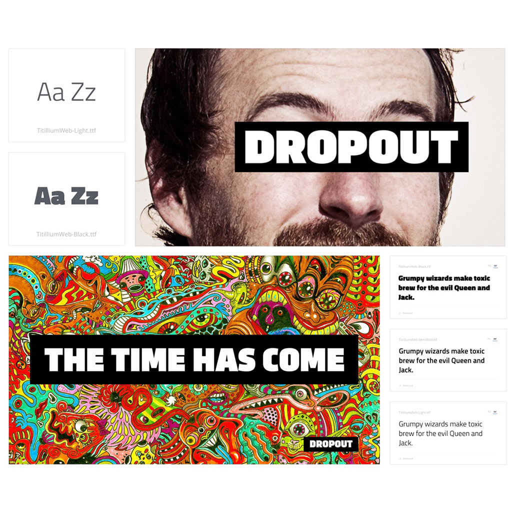
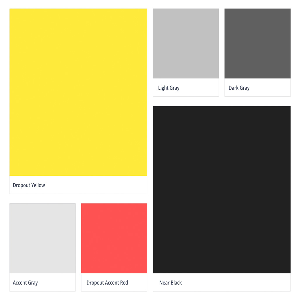
I led the creation of the DROPOUT brand identity from the ground up. This included visual direction, tone of voice, and overall aesthetic.
Design System and User Interface Elements
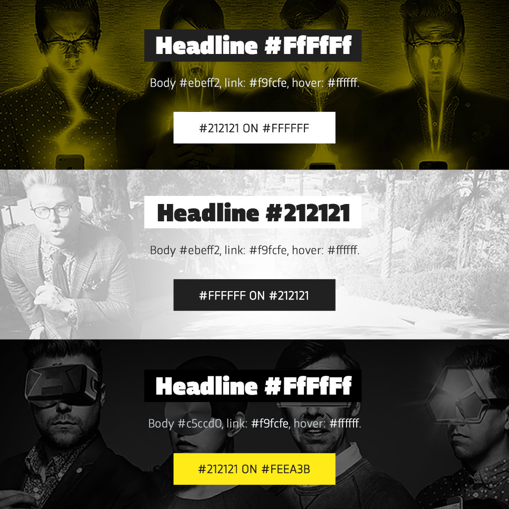
After establishing the brand identity, I built a flexible design system to support internal teams and external partners in creating a cohesive experience across all touchpoints. For more on the process of UI and UX development, visit the link below.
Through cross-functional collaboration, rapid prototyping, and user-focused iteration, we launched a cohesive, standout product that resonated with our tech-savvy audience and laid the foundation for scalable growth.
Key Contributions:
- Successfully launched DROPOUT across web, mobile, and connected TV platforms within tight timelines.
- Created a recognizable, cohesive brand that resonated with CollegeHumor’s evolving audience.
- Built foundational systems that streamlined content production and scaled design consistency across platforms.
- Set the stage for future product evolution with a flexible brand and UX infrastructure.


